SEO Spider
Site Architecture & Crawl Visualisations Guide
Introduction To Visualisations
The Screaming Frog SEO Spider has two types of interactive website visualisations – crawl visualisations, and directory tree visualisations.
The two types of visualisations are fundamentally different and are useful in understanding a site’s architecture in different ways. This guide will explain the differences and highlight how each can be utilised.
Each visualisation type also has 3 different formats:
- Force-Directed Diagram.
- 3D Force-Directed Diagram.
- Tree Graph.
The choice of format type can simply be down to personal taste, but the ‘best’ format to use can also depend on the size of the site, and situation. Watch our video on visualisations, or continue to read our guide below.
While visualisations are beautiful and fun, they don’t provide any more data than is already available in a crawl. They are often not the best way to diagnose issues and don’t always tell the whole story.
However, the strength of visualisations is that they can help provide perspective, communicate ideas, or reveal underlying patterns that are harder to uncover in data, and spreadsheets.
Let’s dig into the two types of visualisations and their differences.
Crawl Visualisations
The ‘force-directed crawl diagram’, ‘3D force-directed crawl diagram’ and ‘crawl tree graph’ visualisations provide a view of how the SEO Spider has crawled the site, by shortest path to a page.
They show a single shortest path to a page from the start URL. They don’t show every internal link, as this makes visualisations hard to scale, and often incomprehensible.

If a page has multiple shortest paths (i.e, multiple links from the same lowest depth), the link that will be displayed is the one that was crawled first, often the first discovered in the source code.
The crawl visualisations are hierarchical by crawl depth, and the lines between URLs represent the shortest path. This makes the crawl visualisations useful when analysing site architecture, and internal linking.
Force-Directed Crawl Diagrams
The force-directed crawl diagram and 3D force-directed crawl diagram are like a heat-map, with the start URL represented by the darkest green, largest node (the circles) in the middle.
This is generally the homepage if you started the crawl there. The lines (known as ‘edges’) represent the link between one URL and another (by shortest path, if you’ve been listening).
The nodes that are slightly smaller than the largest node and are connected by links are URLs that are the next crawl depth level, and as they get further away, the nodes are scaled smaller and lighter with increasing crawl depth.

Indexable pages are represented by the green nodes, while the pastel red highlights URLs that are non-indexable. This makes it quite easy to spot problematic sections or pages of a website.
There are valid reasons for non-indexable pages, but visualising their proportion and where they are, can be useful in quickly identifying areas of interest to investigate further.
The ‘Information’ (i) menu icon provides a key with more information about the colours of nodes.

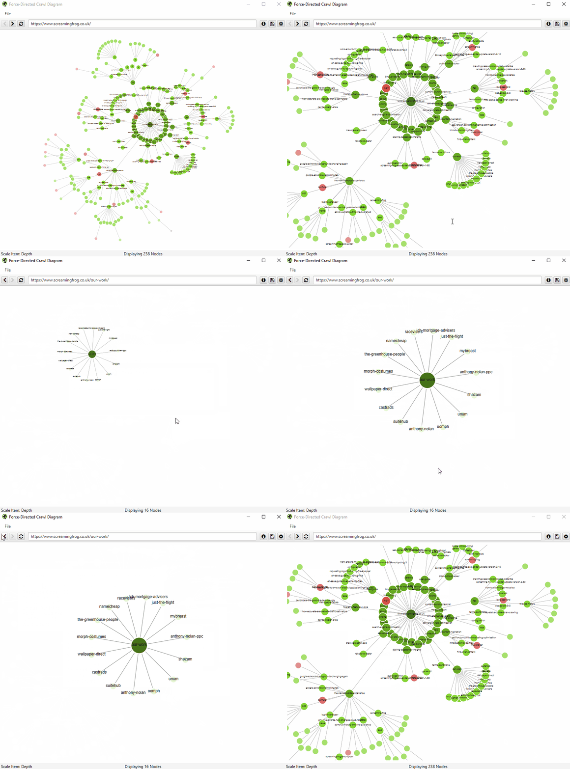
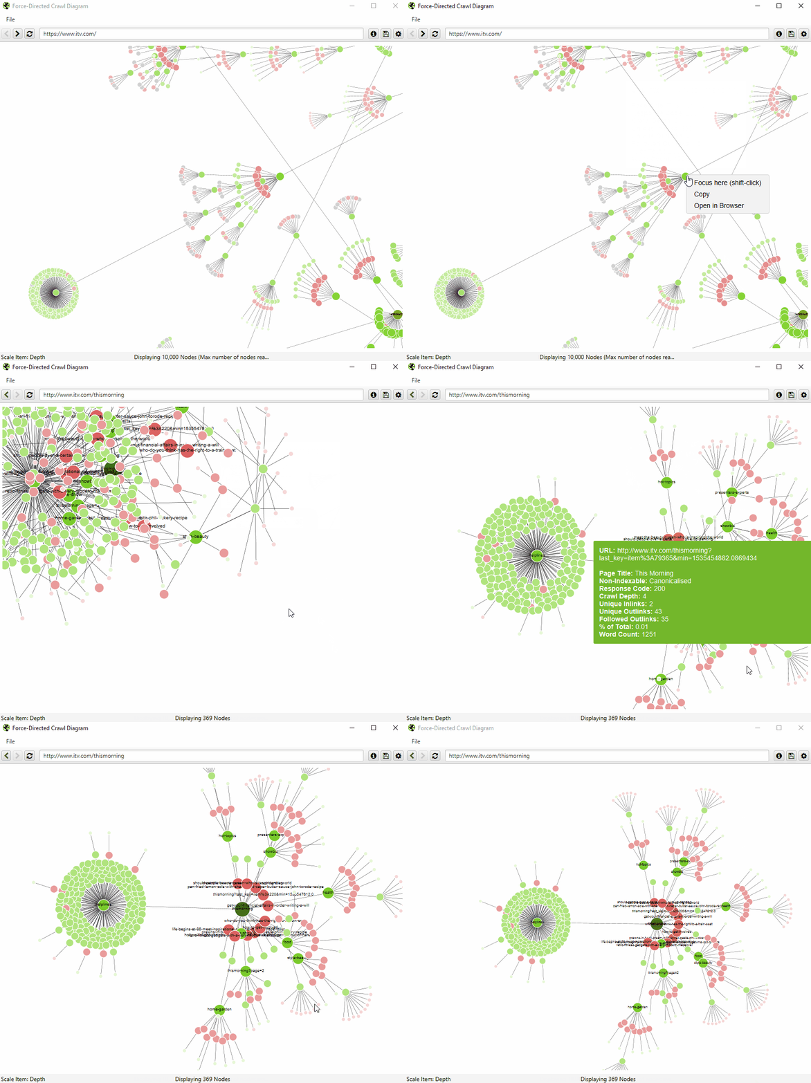
The 2D visualisation will show up to 10k URLs in the browser, but allow you to right-click and ‘focus’ to expand on particular areas of a site to show more URLs in that section (up to another 10k URLs at a time). You can use the browser as navigation, typing in a URL directly and moving forwards and backwards with ease.

When a visualisation has reached the 10k URL limit, it lets you know when a particular node has children that are being truncated (due to size limits), by colouring the nodes grey. You can then right click and ‘explore’ to see the children. This way, every URL in a crawl can be visualised.

The 3D force-directed crawl diagram will open in your default browser, rather than within our inbuilt browser.
This diagram can scale up to 100k URLs. Right-click functionality isn’t available, but the inbuilt browser URL bar can still be used to navigate if required.
The left mouse click will rotate, the wheel will zoom, and right click will pan in the 3D Visualisation. The right-hand configuration allows you to adjust the diagram or search for specific URLs, in a similar way to the 2D diagram.

You’re able to adjust node colours to be based upon response codes, or segments as well.
Crawl Tree Graph
The tree graph format visually is quite different to the force-directed crawl diagram, but fundamentally they represent websites in a similar way, with URLs represented by the circles and the shortest path by hyperlink, as the lines connecting them.
They are hierarchical by crawl depth from left to right by default, but you can flip them around to be top to bottom (or right to left, bottom to top etc).

The crawl tree graphs will also show up to 10k URLs in the browser, but allow you to right-click and ‘focus’ to expand on particular areas of a site to show more URLs in that section (up to another 10k URLs at a time).
Directory Tree Visualisations
The ‘force-directed directory tree diagram’, ‘3D force-directed directory tree diagram’ and ‘directory tree graph’ visualisations show the URL architecture of a website.
Nodes (the circles) are organised by the components of URLs, from protocol, to host and path. Unlike crawl visualisations, nodes do not always reflect resolving URLs, and lines do not represent hyperlinks.

If you’re familiar with directory tree view in the SEO Spider already, then directory tree visualisations are similar. If you’re not, click the directory tree icon in the Internal tab.

The directory tree visualisations are hierarchical by URL component and path, and the lines between URLs represent the directory path. This makes the directory tree visualisations useful when analysing URL structure and general information architecture of a website.
It’s also often easier to spot problems using this view, as URLs that share the same directory usually also share the same template.
Force-Directed Directory Tree Diagram
The force-directed directory tree diagrams are like a heat-map, with the protocol(s) represented by the darkest green, largest node (the circles) generally hanging from the very central node which is the homepage (the hostname).
The lines (‘edges’) represent the URL path, so the protocol nodes will connect to the host, which will connect to the first directory, path and onwards.
The nodes that are slightly smaller than the largest node that are connected by links is the homepage, and as they get further away, the nodes are scaled smaller and lighter by increasing path.
In the directory tree diagram below you can see the path to our author pages, such as https://www.screamingfrog.co.uk/author/screamingfrog/.

Protocol (https://), hostname (www.screamingfrog.co.uk/), directory (/author/) and finally the path, /screamingfrog/, which is a resolving URL. The red nodes under the author directory, are all author pages.
They are red as they are non-indexable with a meta ‘noindex’ tag, and they obviously share the same page template. In the crawl diagram, these pages are distributed throughout visualisation rather than grouped together, as they are linked to and discovered first from various blog pages. Here’s the same view of the author pages –

As the directory tree view groups pages together by path which often share the same template, it often makes it easier to see these types of patterns and get an understanding of general, broad structure.
The 3D force-directed directory-tree diagram will open in your default browser, rather than within our inbuilt browser. It’s easy to identify the same author pages, which are clearly grouped together in the same directory.
Directory Tree Graph
The directory tree graph format represents websites in a similar way to the force-directed directory tree diagram, with the URL components represented by the nodes, and the lines connecting them the URL path.
They are hierarchical by URL path from left to right by default, but you can flip them around to be top to bottom (or right to left, bottom to top etc).

Scaling Force-Directed Diagrams
Both the ‘force-directed crawl diagram’ and ‘force-directed directory tree diagram’ can be scaled by different metrics (by clicking on the cog icon). As described above, the size and colouring of the nodes are scaled by crawl depth, or URL path respectively.
However, both diagrams can be scaled by other items such as – unique inlinks, Link Score (PageRank), or external metrics like Moz Page Authority or Ahrefs URL Rating for example.

This means diagrams can be configured to visualise which URLs on a website have the highest authority (including external link metrics, not just internal links), by using Ahrefs URL Rating, as an example. For our website, the SEO Spider page is the most linked to and authoritative page.

Or alternatively, to only consider internal links, then Link Score represents internal PageRank throughout the site.

Both of the above examples can help visualise key pages and sections of a site that have most authority, and those that require improvement with better linking.
Further Support
The guide above should clarify how each type and format of visualisation can be used in the SEO Spider.
Please also read our Screaming Frog SEO Spider FAQs and full user guide for more information on the tool.
If you have any further queries, then just get in touch via support.


