
Visualisations
Dan Sharp
Posted 19 September, 2018 by Dan Sharp in
Visualisations
There are three main types of visualisation available within the top level menu of the SEO Spider, crawl visualisations, directory tree visualisations and word clouds.
Crawl visualisations are useful for viewing internal linking, while directory tree visualisations are more useful for understanding URL structure and organisation. Word clouds allow you to visualise how much a word is used for linking to or in the text of a particular page.
There are a force-directed diagram, 3D force-directed diagram and tree graph version of the crawl and directory tree visualisation available via the ‘Visualisations’ top-level menu.

Crawl Visualisations
Crawl visualisations include the ‘Force-Directed Crawl Diagram’, ‘3D Force-Directed Crawl Diagram’ and ‘Crawl Tree Graph’.
These crawl visualisations are useful for analysis of internal linking, as they provide a view of how the SEO Spider has crawled the site, by the first link to a page. If there are multiple shortest paths to a page (i.e. a URL is linked to from two URLs at the same crawl depth), then the first URL crawled (often the first in the source) is used.

If you click on the ‘i’ symbol in the top right-hand corner of the visualisation, it explains what each colour represents.
Indexable pages are represented by the green nodes, the darkest, largest circle in the middle is the start URL (the homepage), and those surrounding it are the next level deep, and they get further away, smaller and lighter with increasing crawl depth (like a heatmap).
The pastel red highlights URLs that are non-indexable, which makes it quite easy to spot problematic areas of a website. There are valid reasons for non-indexable pages, but visualising their proportion and where they are, can be useful in quickly identifying areas of interest to investigate further.
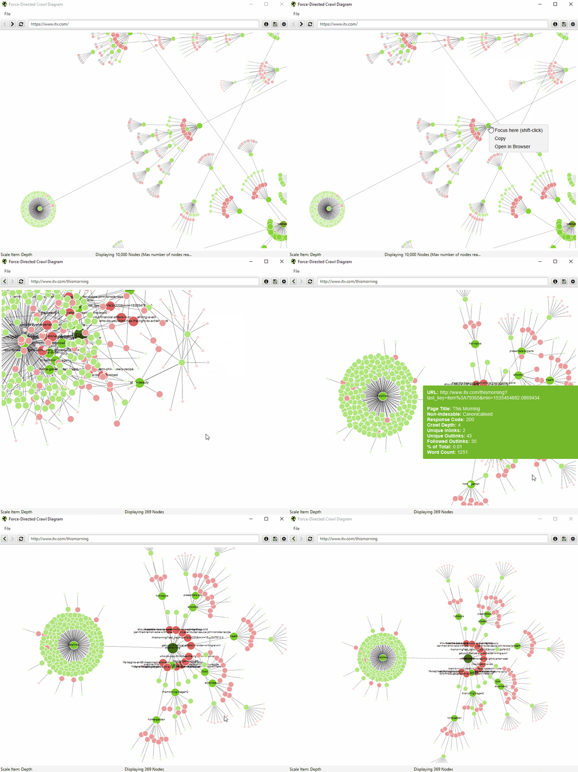
The visualisation will show up to 10k URLs at a time, as they are extremely memory intensive. However, you are able to view them from any URL to view from that point.
You’re also able to right-click and ‘focus’ to expand on particular areas of a site to show more URLs in that section (up to another 10k URLs at a time). You can use the browser as navigation, typing in a URL directly, and moving forwards and backwards.

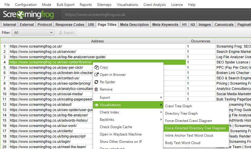
You can also type a URL directly into the browser, or right-click on any URL in a crawl, and open up a visualisation from that point as a visual URL explorer.
When a visualisation has reached the 10k URL limit, it lets you know when a particular node has children that are being truncated (due to size limits), by colouring the nodes grey. You can then right click and ‘explore’ to see the children. This way, every URL in a crawl can be visualised.
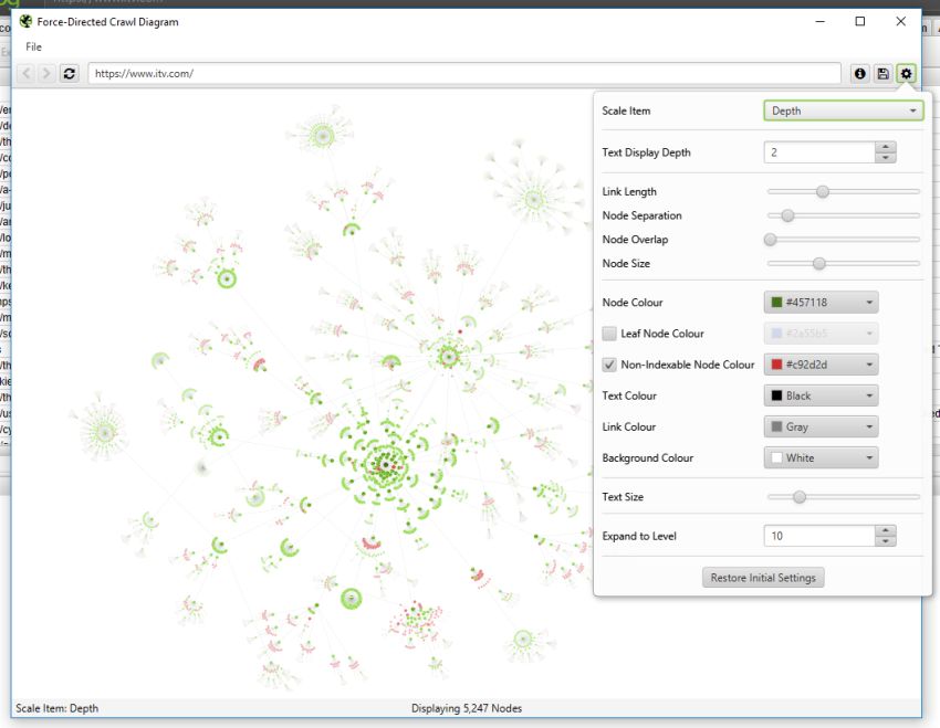
You’re also able to configure the size of nodes, overlap, separation, colour, link length and when to display text.
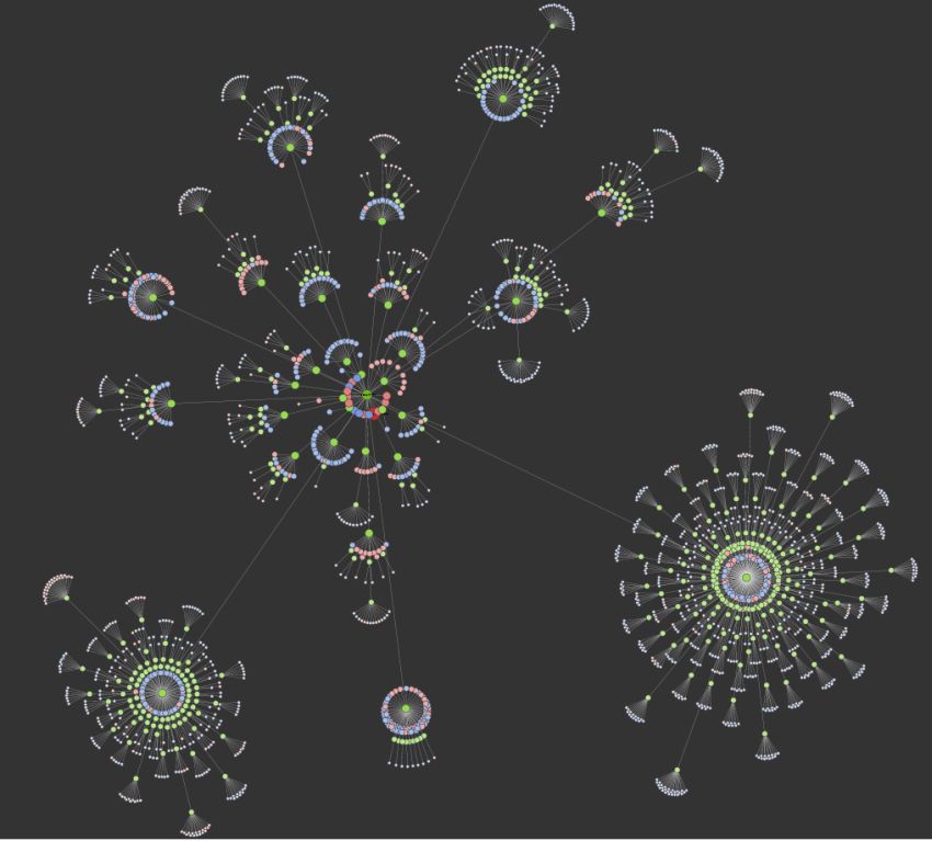
You’re therefore able to produce colourful visualisations, like the below.
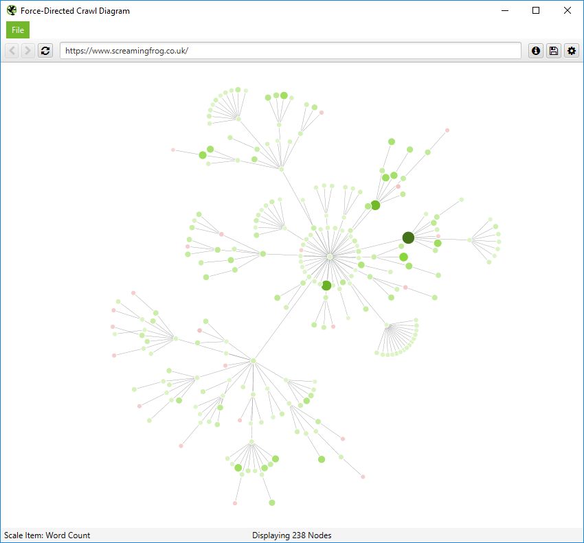
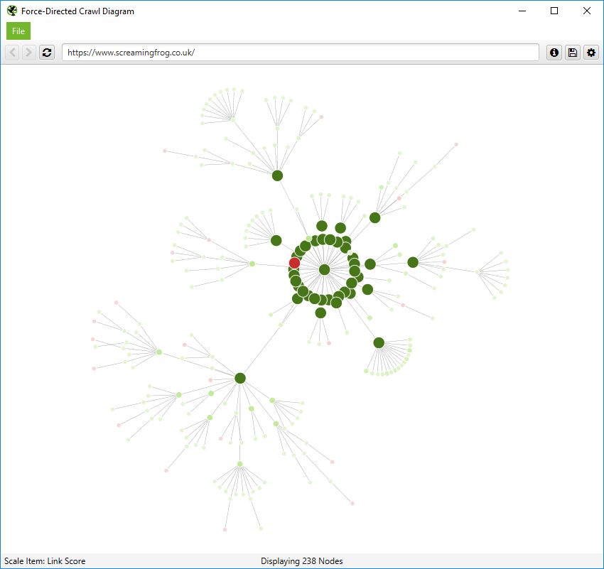
You’re also able to scale visualisations by other metrics to provide greater insight, such as unique inlinks, word count, GA Sessions, GSC Clicks, Link Score, Moz Page Authority and more.
The size and colour of nodes will scale based upon these metrics, which can help visualise many different things alongside internal linking, such as sections of a site which might have thin content.
Or highest value by link score.
The 3D force-directed crawl diagram will open in your default browser, rather than within our inbuilt browser.
This diagram can scale up to 100k URLs. Right-click functionality isn’t available, but the inbuilt browser URL bar can still be used to navigate if required.
The left mouse click will rotate, the wheel will zoom, and right click will pan in the 3D Visualisation. The right-hand configuration allows you to adjust the diagram or search for specific URLs, in a similar way to the 2D diagram.
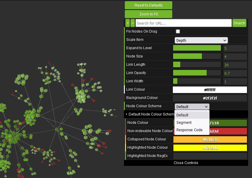
You’re able to adjust node colours to be based upon response codes, or segments as well.
You can also view internal linking in a more simplistic crawl tree graph, which can be configured to display left to right, or top to bottom.
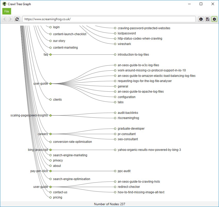
You can right click and ‘focus’ on particular areas of the site. You can also expand or collapse up to a particular crawl depth, and adjust the level and node spacing.
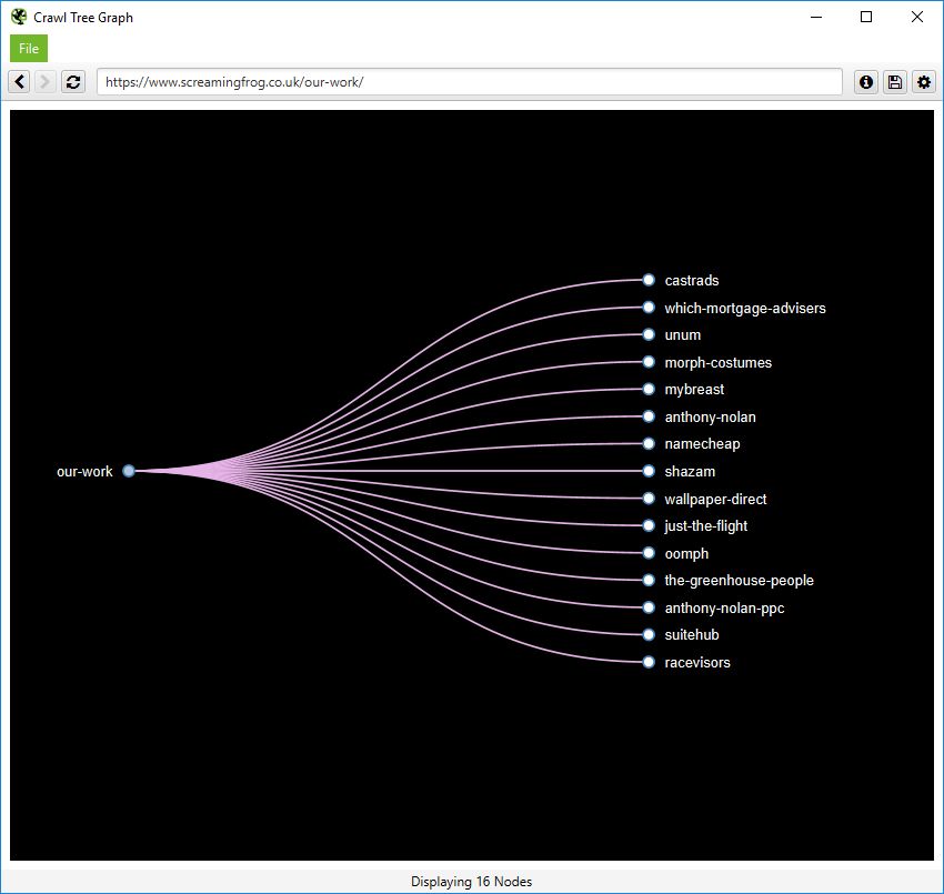
Like the force-directed diagrams, all the colours can also be adjusted.
Directory Tree Visualisations
Directory Tree visualisations include the ‘Force-Directed Directory Tree Diagram’, ‘3D Force-Directed Directory Tree Diagram’ and ‘Directory Tree Graph’.
The ‘Directory Tree’ view helps to understand a site’s URL architecture, and the way it’s organised, as opposed to internal linking of the crawl visualisations. This can be useful, as these groupings often share the same page templates and SEO issues.
The force-directed directory tree diagram is unique to the SEO Spider (and you can see it’s very different for a crawl of our site than the previous crawl diagram), and easier to visualise potential problems.
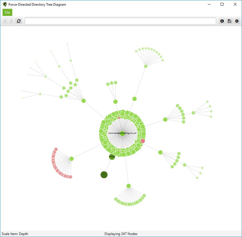
Notice how the non-indexable red nodes are organised together, as they have the same template, whereas in the crawl diagram they are distributed throughout. This view often makes it easier to see patterns.
This can also be viewed in the 3D force-directed directory tree diagram.
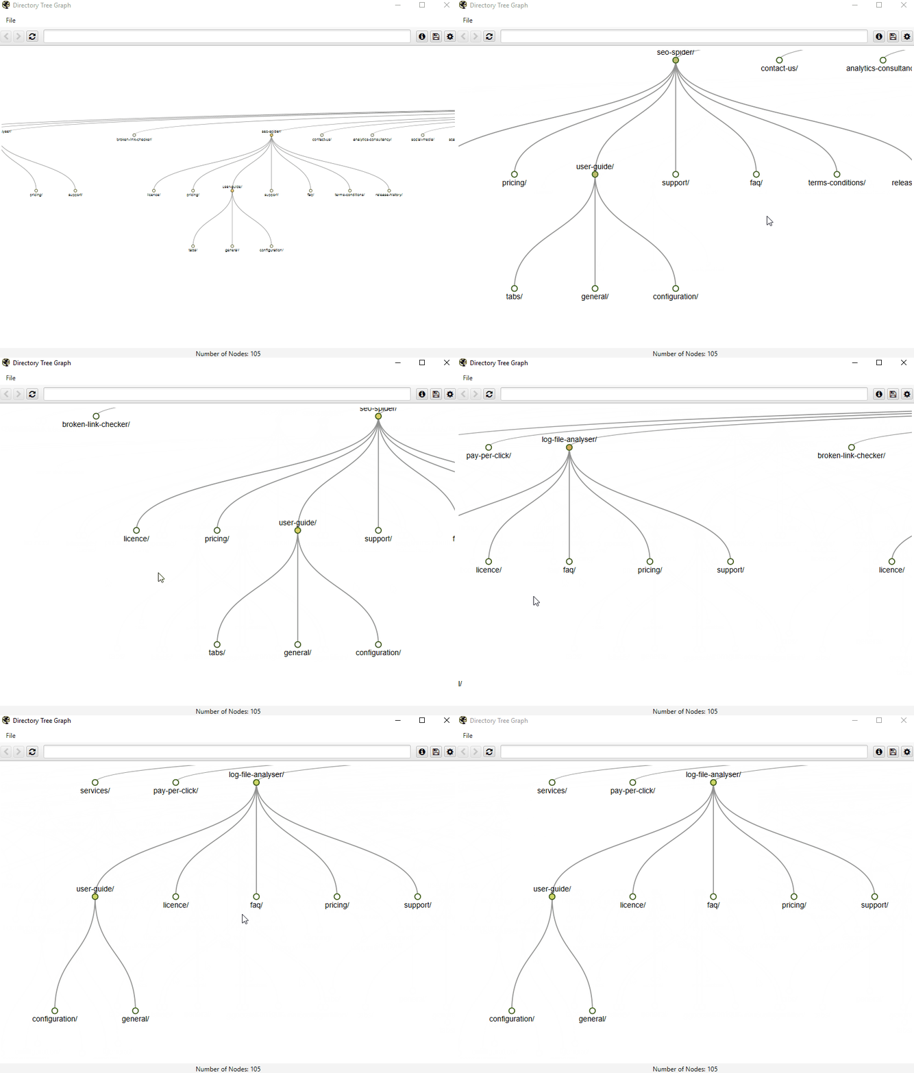
Or the simplistic directory tree graph format, too. These graphs are interactive and here’s a zoomed in, top-down view of a section of our website.
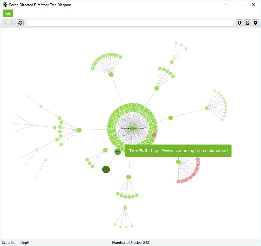
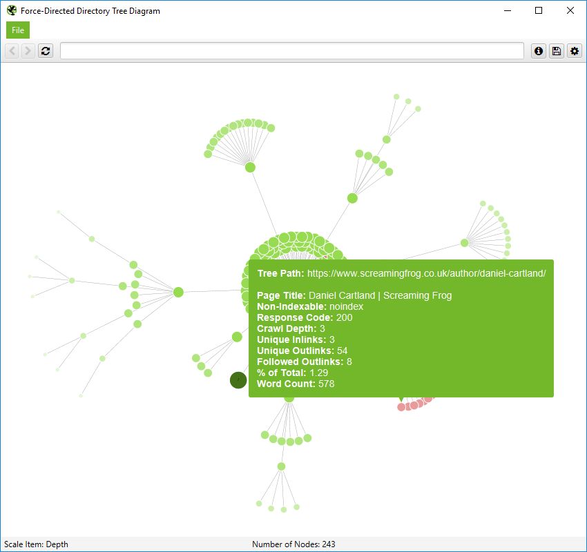
It’s important to remember that nodes don’t always represent a URL in this directory tree view. They can merely represent a path, which doesn’t exist as a URL. An example, of this, is the subfolder /author/ for the Screaming Frog website. It has URLs contained within the subfolder (/author/name/) which exist, but the /author/ path itself doesn’t.
However, in a directory tree view, this is still shown to enable grouping. However, only the ‘path’ is shown when you hover over it –
A URL will contain more information like this –
Inlink Anchor Text & Body Text Word Clouds
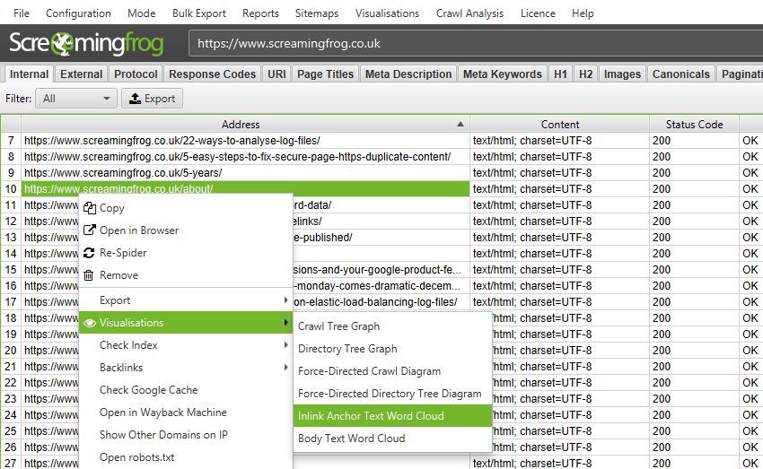
The options in the top navigation will show the word clouds for the URL entered as the starting point of the crawl. To see these for any page URL right-click the URL in the main window and go to ‘Visualisations’.
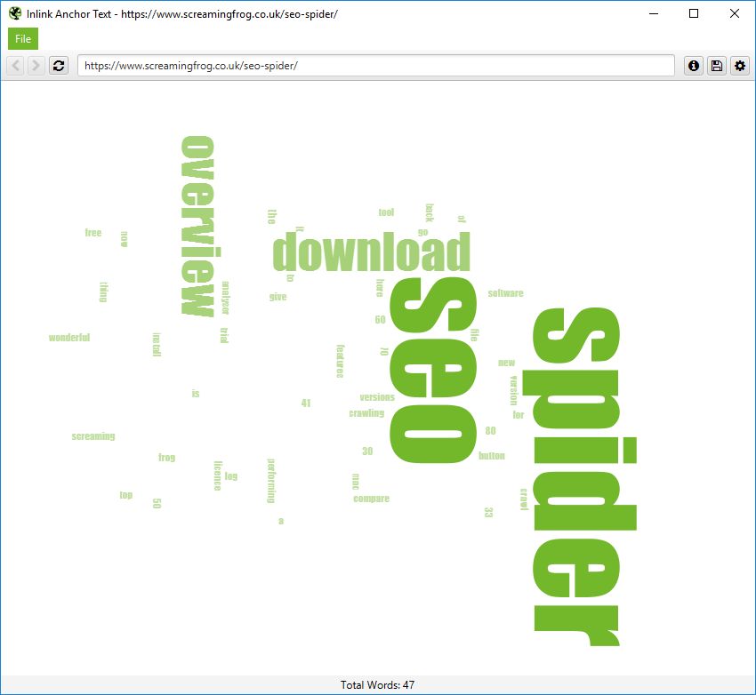
The ‘Inlink Anchor Text Word Cloud’ includes all internal anchor text to a given URL and image alt text of hyperlinked images to a page.
The ‘Body Text Word Cloud’ includes all text within the HTML body of a page. To view this visualisation, the ‘Store HTML‘ configuration must be enabled.
Content Cluster Diagram
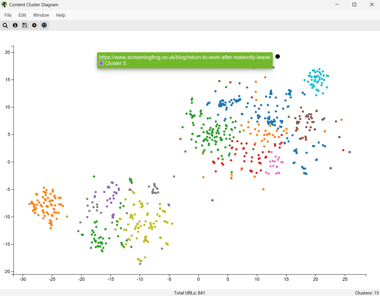
The Content Cluster Diagram is a two-dimensional visualisation of URLs from the crawl, plotted and clustered from embeddings data. Please read ‘How to Identify Semantically Similar Pages & Outliers‘ to set this up.
It can be used to identify patterns and relationships in your website’s content, where semantically similar content is clustered together.
The diagram can display up to 10,000 pages at a time. The closer the nodes are together, the more semantically similar they are to each other.
The example diagram above highlights the semantic relationship of an animal website.
Tiger populations are tightly grouped together, with the nearest neighbour, the Liger hybrid between the Tiger and the Lion, and then other big cats such as Leopards, Jaguars, and Cheetahs as the next neighbours and so on.
The diagrams can visualise the scale of clusters of content on a site, or identify potential topical clusters that are semantically related – yet might be distantly integrated for the user.
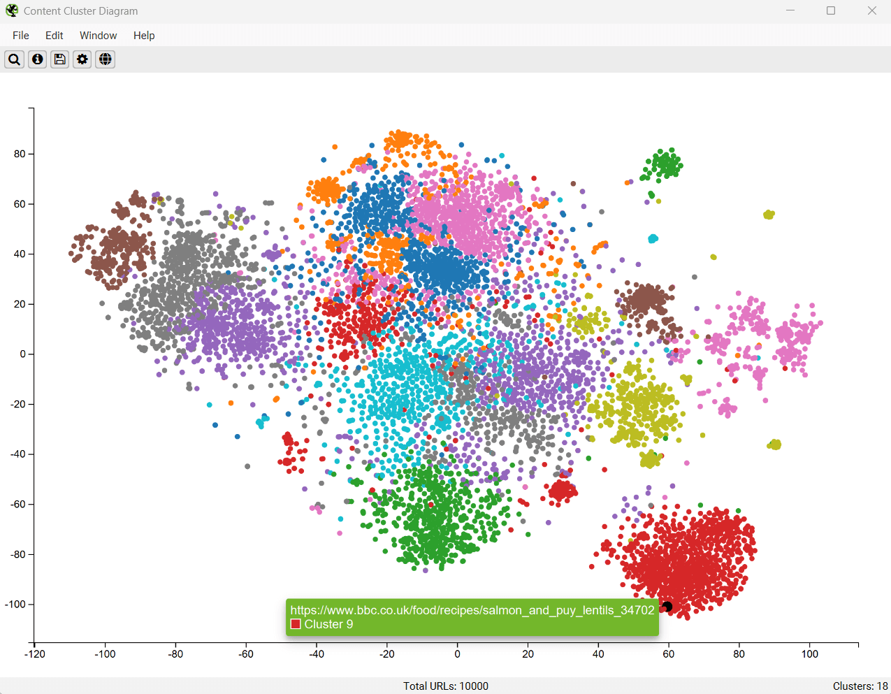
Low-relevance content and outliers can be easily identified as isolated nodes on the edges of the diagram.
The cog allows you to adjust the sampling, dimension reduction, number of clusters and colour schemes used. You can select to use ‘segments’ as clustering node colour scheme as well.
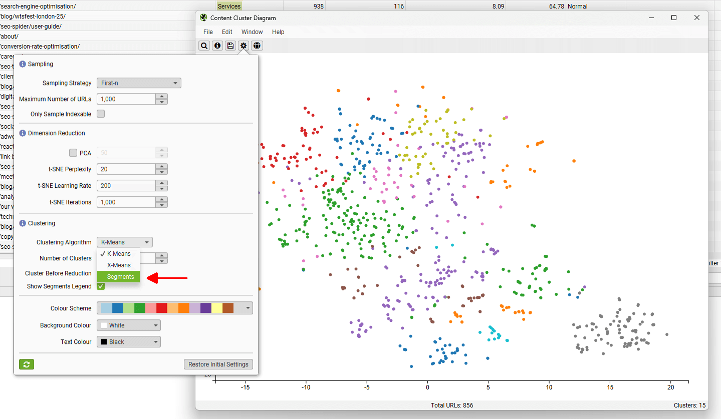
This can be helpful to spot when two semantically similar pages are in different segments, which could be considered for internal linking to each other.
In the case of the above, the two pages that cover the same subject are in different sections of the website – tutorials and our issues library, and should refer to each other with internal links.
Troubleshooting
- When exporting as an .svg this will have the current view port at the time of the export. No information is lost, but you’ll need to use a proper SVG capable application to adjust the view, such as Adobe Illustrator or Inkscape.