How to Build User Trust With CRO & UX Tweaks
Oliver Brett
Posted 22 July, 2021 by Oliver Brett in SEO
How to Build User Trust With CRO & UX Tweaks
With this summer’s BrightonSEO pushed online (again) due to the global pandemic, spare a moment for the poor SEO conference celebrities, who must go without applause, admiration, and retweets for another season. It’s a hard life.
As a self-declared SEO conference rockstar, the advantage of moving BrightonSEO online this year has been being able to edit out all the ‘umms’ ‘errs’ ‘arrs’ etc. from my video presentation. The disadvantage is that I’m now sick of my own voice. (But then again, isn’t everyone?)
In this blog post I’ll be giving an overview of my talk, which is titled: Spilling the T in EAT: How to easily build user trust with simple CRO + UX tweaks.
When to Focus on User Trust
A user’s trust of your site isn’t always the most pressing issue a site can have, from an SEO perspective. Often, you’re too busy putting out technical fires or building a brand from scratch, one backlink at a time.
But when the technical foundations are there, your content marketing/PR is on point, and yet the graphs start to plateau; this can be a great time to take stock of a site and really dig into whether it’s as strong as it can be from a trust perspective.
E.A.T. (if you’re reading the Screaming Frog blog you’ll likely already know) stands for:
- Expertise – Do you know what you’re talking about?
- Authority – Does anyone else like you?
- Trust – Are you secretly evil?
If only Google was a British company, they’d have called it T.E.A.
These three pillars largely overlap with how a normal real human would approach a website/brand/company. What they boil down to is, why should we pick your site over your competition? Why you?

And we can apply this key question across all our optimisation work when thinking about user trust.
Easy CRO Audit Process
So how do we make our sites more trustworthy? Well, I have a budget-friendly and easy process for you to follow, that comprises of six simple steps:
Sanity Check

Common sense is one of the best weapons you can possess when it comes to assessing how trustworthy a site is. Grab a notepad and go through the site, making notes on things that really bug you like:
- Out of date social media icons
- Aggressive SSL 100% SECURE!!1! icons
- Aggressive BUY NOW!!1! CTA buttons
- Rubbish/irrelevant stock photography
- Colour/font consistency
- Annoying animations that the CEO insisted on adding to the site
- Keyword stuffing for keyword SEO optimisation™
- ‘ave ya thought ‘bout inconsistencies in ya tone of voice?
- Irritatingly lengthy contact forms
- Auto-play video/audio
- Broken checkouts… which in theory should be obvious, but not always. 😊
- Anything else that’s particularly disruptive to your overall impression of the site, and how much you trust it
This will give you a starting point for recommendations. If we were doing things properly/with a big budget, we’d consider validating these concerns with user testing or heatmapping- but this process is about quick wins™.
Getting Data
I’m 100% bias, but an easy way to get user data en masse from Google Analytics/Search Console is via Screaming Frog’s SEO Spider Tool, which can connect up to the required APIs.
Once you’ve connected Analytics and Search Console in the Spider, you can then easily crawl a site and output a wide range of metrics per URL. These can then be exported into the spreadsheet tool of your choice, and you can then format the sheet so that certain metrics trigger a cell highlight. For example, you can then see from all your blog posts, which have a bounce rate of over 75%.

Examining Outliers
From this data dump, you can then filter down and isolate the areas that might be barriers to trust:
- High bounce rates – could be due to the first impressions you’re giving users above the fold, before they scroll down. Site speed might also be playing a role here.
- Low time on page – Does the content keep users interested as they scroll? Is it surprising enough to keep them on their toes?
- High exit rate – Can you improve internal linking to entice users to stay for longer? Where are they supposed to go when they get to the bottom of a page, is there an interesting place for them to go next?
- Low conversion rates – In theory everything outlined here should collectively improve your conversion rates, though an extra trick I’ve read about is the inclusion of images of people, who’s eyeline connects up with whatever CTA button you want users to click. For example:

- Low click through rate – Meta data is your best bet for improving click through rates from the SERPs to your site. Try to avoid using ‘homepage’ as your site’s main page title. 😊
- User intent – if 8 of the 9 results on page 1 are all informational pages rather than commercial, maybe you should be building a new page rather than trying to cram more info into your commercial page.
- Geography and languages – there’s loads of Google Analytics stats on which sections of your audience are having good/bad experiences. They might inform how badly you need a Welsh-language version of your site.
Competitor Analysis
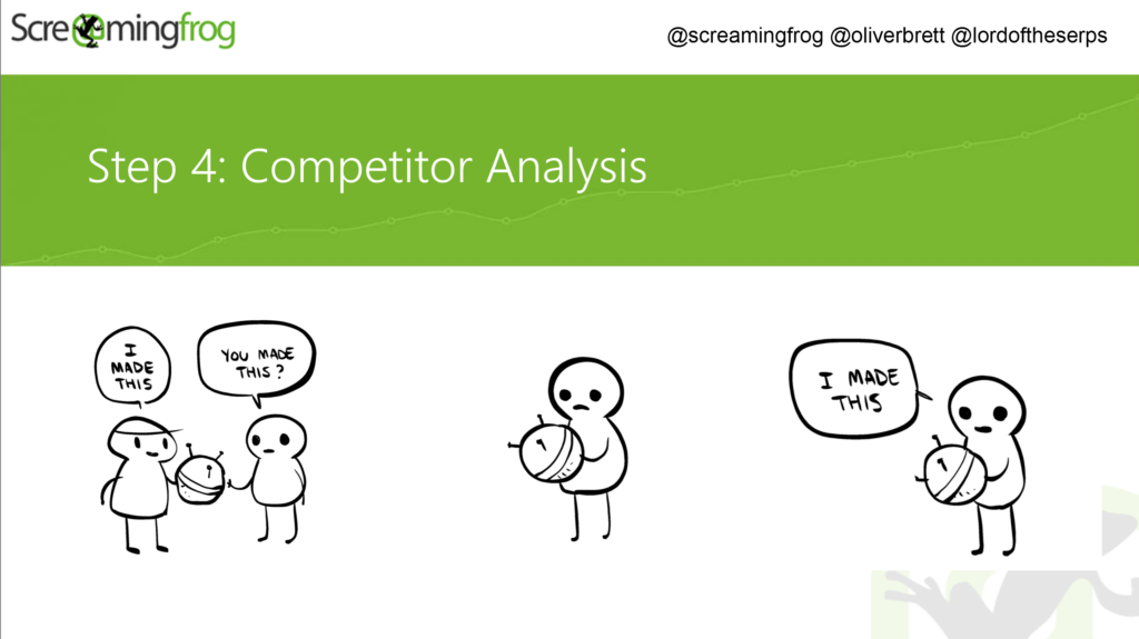
There’s loads of great SEO tools out there designed to take the pain out of competitor analysis.
But if you want a quick assessment, the easiest way to proceed is just to Google your core keyword targets, see who’s ranking highly, and then assess what they have that you lack.
One of the main things to consider is, what do websites ranking in the top five all have in common? Are they heavy on text? Do they all feature videos? Are pricing and shipping details clearly labelled?
From answering these questions, and once again applying some good old common sense, you should be able to work out what you need to add to your pages in order to catch up with the pack.
UX
User eXperience (sic) is inherently subjective, but there’s still some solid frameworks a lone SEO can apply in order to tidy things up.
The first thing to consider is- what does the site look like to your average user? You can find these stats in Google Analytics- mobile or desktop? What screen size? What browser? What OS?
All these clues will help inform you on what the most typical user experiences. Just because you’ve not touched Internet Explorer since school, doesn’t mean Grandma also got the memo.

The next step is to consider the basic elements of the site, use them, and think about how they could be improved. For example:
- Main navigation – is it easy to use? Is it clearly signposted? Does the ordering make sense? Do you have a clear main CTA (‘get a quote’/’contact us’)?
- Forms – are they easy to use? Are they easy to find? Are they as short as they can possibly be? Are they supported/surrounded by other trust signals such as user reviews?
- Breadcrumbs – breadcrumbs are cool if you’re either Googlebot, a user, or a pigeon.
- Filters – are your product filters as simple to use as possible? Do they even work?
Signposting Trust
Finally, the meat of my talk was around elements you can add to your site to further boost user trust, and in turn boost your conversion rates:
- Reviews – everyone loves external validation
- Ratings – everyone loves external validation, especially when it can earn you starts on the SERPs if you use the right markup
- Testimonials – personal testimonials featuring a headshot, name, and company name add an extra layer of validation and are a great option if you’re a B2B company that struggles to get lots of customer reviews
- Logos – who you supply, who you stock, who you service; logos are an easy way to associate yourself with the calibre of customers/clients you’re looking to attract
- Accreditations – if you are specially qualified to do something very technical/safe, tell your audience!
- Meet the Team – this is an easy win, it adds a layer of authenticity and makes your brand appear more human/approachable
- Contact Page – By including a Google Map widget to your contact page you can showcase your real physical location which adds to the idea that you’re a legitimate business
- Explain Why – ‘Sign up to our newsletter!’ is great, but why not try ‘Sign up to our newsletter for exclusive discounts and pro tips!’
- GDPR – If you’ve not got your privacy and data policies visible on your site… you’re only 3 years too late at this stage…
This One Weird Trick- Trust Banners
If you take one thing away from this article, let it be this:
Trust banners are a really great way to get your core trust messages across to users. And they’re super simple to make:
- Come up with 4-5 USPs that makes your business stand out
- Get some simple illustrations to support
- Put these banners across your homepage, category pages, services pages, product pages etc.
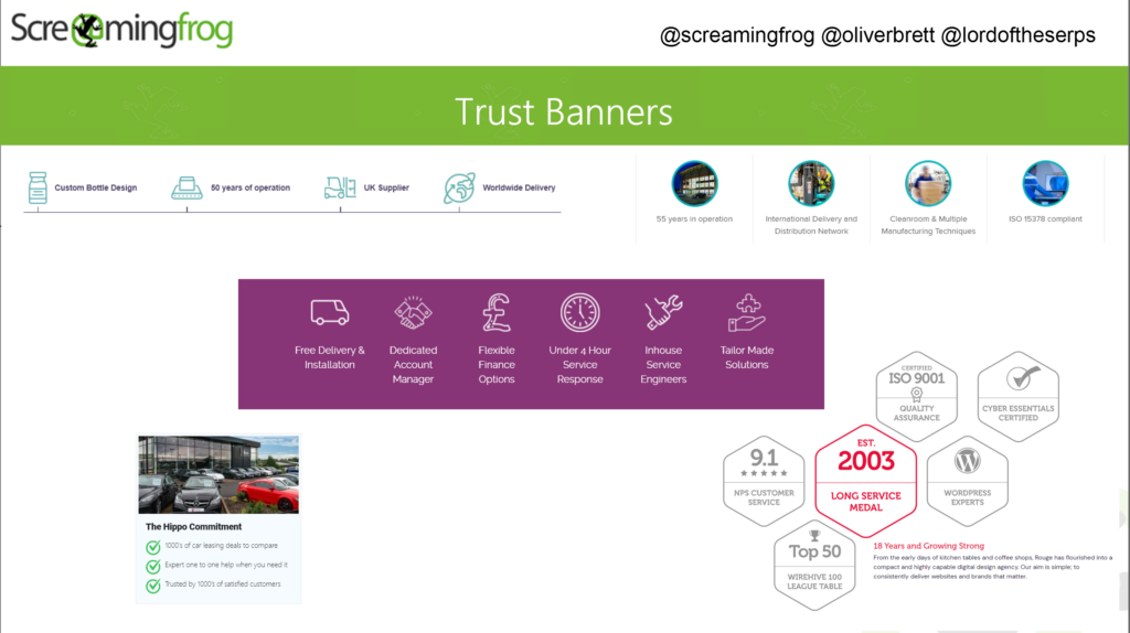
The more you can repeat these messages in this visual format the better, as reinforcement is key.
So there you have it, my top tips on improving user trust through UX and CRO tweaks. Hopefully that’s been useful.
All my slides should be visible here after my talk goes live on the 22nd of July, though without the context of my script I’m not sure if all the punchlines/Tolkien references will land.
If you want the full experience, and countless other great presentations do sign up for a full BrightonSEO pass here.
And, if you are attending BrightonSEO in September (maybe IRL this time?!) then look out for Patrick Langridge our Head of SEO, who will be on stage telling you all about his ‘10 mistakes in 10 years of SEO’.


Not a bad article despite all its sarcasm. But could you post articles using better UI techniques? The font is too light, not enough contrast, and it is too small a la 2010. Luckily some list items were in bold typeface or I would not have read anything. I loved the frog images, tough! They were the best part.
Good article Oliver.
I wish people would stop over-using EAT though, it’s not a technical SEO concept.
Its a guideline for Google’s internal quality team.
What a nice article! Thank you so much.
Main navigation has to be one of the pillars of usability on the website
Good article Oliver!!! Thank you so much.